macOS 26 FinderGate continues as designer shows how it should be done
How did your country report this? Share your view in the comments.
Diverging Reports Breakdown
macOS 26 FinderGate continues as designer shows how it should be done
The new Finder icon in the first beta of macOS Tahoe 26 raised a lot of eyebrows when Apple did more than glassify it: the company also flipped the light and dark sides. The internet wasn’t happy, and beta 2 saw the natural order of things restored – but many still think Apple has lost sight of an essential element, and one designer has put it right. Michael Flarup, who foresaw the glass look back in 2021, fixed it.
The internet wasn’t happy, and beta 2 saw the natural order of things restored – but many still think Apple has lost sight of an essential element, and one designer has put it right …
We noted the problem.
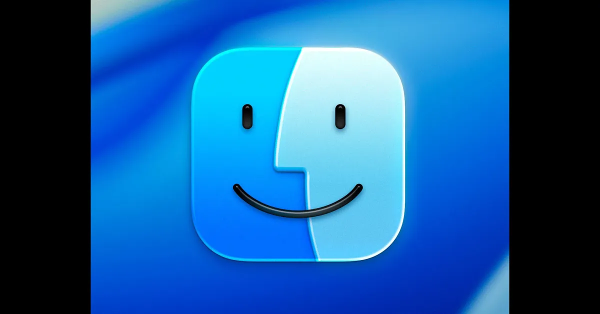
The issue? Finder has a dark side and a light side. The dark side is located on the left half of the face while the light side makes up the right half. Finder in macOS Tahoe 26 reversed this arrangement (while using an outline effect around the right side).
Stephen Hackett was the standard bearer for the movement to restore decades of tradition.
The Finder logo has changed over the years, but the dark side has been on the left forever […] I know I am going to sound old and fussy, but Apple needs to roll this back.
He welcomed Apple’s reversal of the flip in beta 2.
Our 14-day national nightmare is over. As of Developer Beta 2, the Finder icon in macOS Tahoe has been updated to reflect 30 years of tradition
However, not everyone is happy. John Gruber grabbed his pitchfork to continue the struggle against the forces of dark– uh, not enough lightness.
The Tahoe beta 2 Finder icon is slightly better, but seeing it this way makes it obvious that the problem with the Tahoe Finder icon isn’t whether it’s dark/light or light/dark from left to right. It’s that with this Tahoe design it’s not 50/50. It’s the appliqué — the right side (the face in profile) looks like something stuck on top of a blue face tile. That’s not the Finder logo.
Designed Michael Flareup, who kind of foresaw the glass look back in 2021, fixed it.
I think this looks way better. It still has the glassiness needed for the new UI, but restores balance.
Should Apple be sending Flarup a check and taking his design in exchange? Let us know your thoughts in the comments.
Highlighted accessories
Render: Michael Flarup