Say Goodbye to Microsoft’s Iconic “Blue Screen of Death”; It’s Being Replaced by a More Simpler, All-Black Alternative
How did your country report this? Share your view in the comments.
Diverging Reports Breakdown
Say Goodbye to Microsoft’s Iconic “Blue Screen of Death”; It’s Being Replaced by a More Simpler, All-Black Alternative
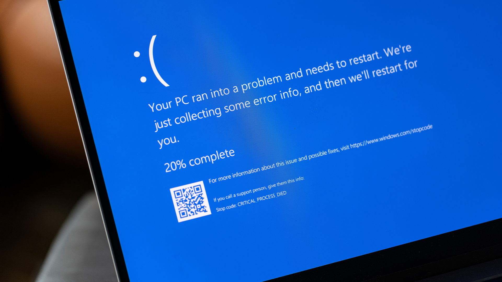
Microsoft’s Blue Screen of Death (BSOD) is finally retiring after decades of service. The next Windows 11 update will now feature a more simplified UI. Microsoft hasn’t specified what update the BSOD will phase out; however, we expect the changes to roll out within the next one. The new “BSOD” replacement has entirely changed the color scheme from blue to black, claiming that this somehow meets Windows 11 design principles. There’s no more QR code or any extra information, so this UI does indeed target the “simplicity” Microsoft is looking for.
Microsoft’s Blue Screen of Death Has Served Us For Nearly Forty Years, And Its Replacement Doesn’t Seem a Worthy One
Well, Microsoft BSOD holds great memories for all of us on the internet, mainly since encountering it meant that you had likely run into a complex issue. This screen has created moments of horror for several of us out there, but most importantly, the BSOD has put us in situations where coming out means either spending money out of pocket, or getting involved in hours or even days of troublesome debugging. However, it is a bit disappointing to see Microsoft phasing out the iconic BSOD interface, and it will now be replaced by a “not-so-worthy” alternative, which we’ll talk about ahead.
Microsoft says that their next round of Windows updates will make the platform “enterprise-ready” and that the changes in the UI reflect a broader strategy of easily “navigating unexpected restarts”, although we are unable to figure out how the change in UI helps with this motive. Anyway, the next Windows 11 update will most likely include a new UI, which, according to Microsoft, “improves readability and aligns better with Windows 11 design principles”. The statements sound optimistic, but when you look at the BSOD replacement, there are many questions.
The new “BSOD” replacement
Firstly, Microsoft has entirely changed the color scheme from blue to black, claiming that this somehow meets Windows 11 design principles. Moreover, the only information apart from the usual statement is the error code, and compared to BSOD, there’s no more QR code or any extra information, so in one way, this UI does indeed target the “simplicity” Microsoft is looking for. The Blue Screen of Death served us for over forty years, but like all things, it also has to end here.
Microsoft hasn’t specified what update the BSOD will phase out; however, we expect the changes to roll out within the next one. It is indeed the end of an era.
Source: https://wccftech.com/say-goodbye-to-microsoft-iconic-blue-screen-of-death/